Plotting just your data often helps you gain insight into how it has changed over time. But what if you want to know why it changed? Although correlation does not always imply causation, it is often useful to graph multiple things together, that might logically be related. For example, recessions can affect many things ... such as the labor participation rate.
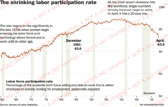
Here's an example of a labor participation graph from The Washington Post. Notice that they show recessions as a shaded area. This seems like a useful thing to do, and I think it adds context to the values being plotted. Therefore I would like to show you how to create a similar graph using SAS software.
Several years ago in my blog, I created this type of graph using SAS/Graph's Proc Gplot. And now I'd like to re-visit this topic, using the latest data and the latest SAS software (ODS Graphics, Proc SGplot).
I downloaded the data from the BLS website in Excel spreadsheet format, and used Proc Import to bring the data into a SAS dataset. I then started with a basic plot, using the following minimal code:
proc sgplot data=my_data;
format date year4.;
series x=date y=col1;
yaxis display=(nolabel);
xaxis display=(nolabel);
run;
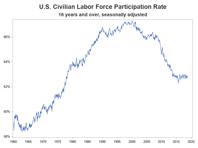
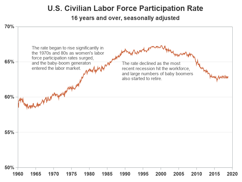
We're off to a good start, but now let's customize the graph to use the same axes and colors as the original graph, and also annotate some explanatory text.
data anno_text;
length function $20 layer $8 x1space y1space $20 color fillcolor $12 label $100;
layer="front";
function="text"; textcolor="gray55"; textsize=10; anchor='left';
width=100; widthunit='percent';
x1space='wallpercent';
y1space='wallpercent';
x1=6; y1=85; label="The rate began to rise significantly in"; output;
y1=y1-3.6; label="the 1970s and 80s as women's labor"; output;
y1=y1-3.6; label="force participation rates surged,"; output;
y1=y1-3.6; label="and the baby-boom generaton"; output;
y1=y1-3.6; label="entered the labor market."; output;
x1=48; y1=74; label='The rate declined as the most'; output;
y1=y1-3.6; label='recent recession hit the workforce,'; output;
y1=y1-3.6; label='and large numbers of baby boomers'; output;
y1=y1-3.6; label='also started to retire.'; output;
run;
proc sgplot data=my_data nowall sganno=anno_text;
format date year4.;
series x=date y=col1 / lineattrs=(color=cxcb633b thickness=2px);
yaxis display=(nolabel)
values=(.50 to .70 by .05) grid
valueattrs=(size=11pt weight=bold color=gray33)
offsetmin=0 offsetmax=0;
xaxis display=(nolabel)
values=('01jan1960'd to '01jan2020'd by year5)
valueattrs=(size=11pt weight=bold color=gray33)
valuesrotate=vertical fitpolicy=rotate notimesplit
offsetmin=0 offsetmax=0;
run;
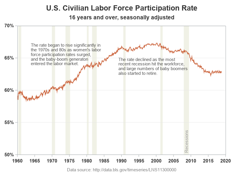
Adding the Recessions
And now, all we need is the shaded areas to represent the recessions. I found a list of the start and end dates of recessions on Wikipedia, and copy-n-pasted them into the datalines section of a SAS dataset.
data anno_recessions;
format recession_start recession_end date9.;
informat recession_start recession_end date9.;
input recession_start recession_end;
datalines;
15apr1960 15feb1961
15dec1969 15nov1970
15nov1973 15mar1975
15jan1980 15jul1980
15jul1981 15nov1982
15jul1990 15mar1991
15mar2001 15nov2001
15dec2007 15jun2009
;
run;
I first considered using a blockplot to add the recessions to the graph, but I prefer not to combine the block (recession) data with my line data (which creates a 'jagged' dataset with lots of missing values). Therefore I opted for using annotate instead. I used a simple data step to add annotate commands that draw a gray/tan polygon from the start to the end of each recession. The polygons extend from the bottom of the graph (y1=0) to the top (y1=100).
data anno_recessions; set anno_recessions;
length function $20 layer $8 x1space y1space $20 color fillcolor $12 label $100;
layer='back';
display='fill'; fillcolor='cxf0f1e6';
x1space='datavalue'; y1space='wallpercent';
function='polygon'; x1=recession_start; y1=0; output;
function='polycont'; x1=recession_end; y1=0; output;
function='polycont'; x1=recession_end; y1=100; output;
function='polycont'; x1=recession_start; y1=100; output;
run;
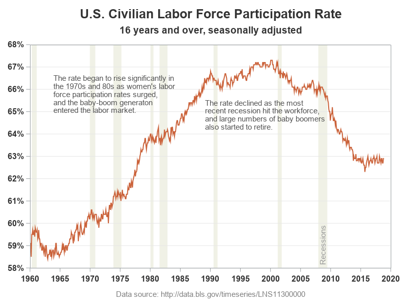
Here's what the final graph looks like. Not too shabby, if I do say so myself!
Other versions of the truth ...
And of course, if you want to change the y-axis to zoom in, or zoom out, it's a very simple code change. Below are two more examples of the same data showing a different range for the y-axis. But be careful - this can change the way people perceive the data (did you know you had so much power over people!?!)
yaxis values=(.58 to .68 by .01)
yaxis values=(0 to 1.00 by .20)
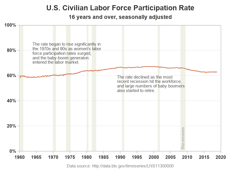
Which of my three versions do you think is a more true representation of the data? (feel free to discuss in the comments) And if you'd like to experiment with the code, here's a copy.


1 Comment
Had to comment out /*valuesrotate=vertical*/ to get the graphs. Output looks the same though.